ESPORTS SEASONAL CIRCUIT
OVERVIEW
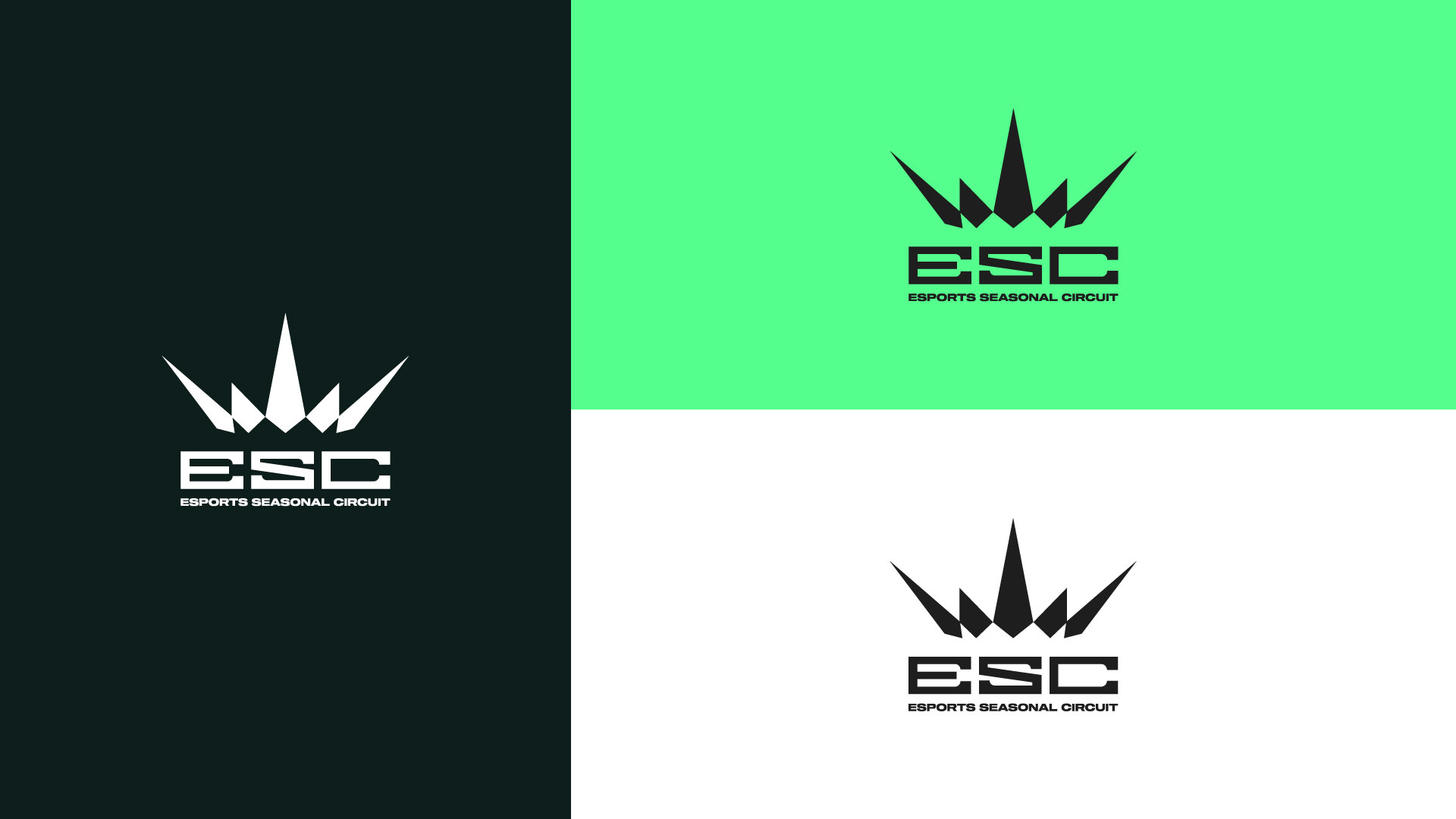
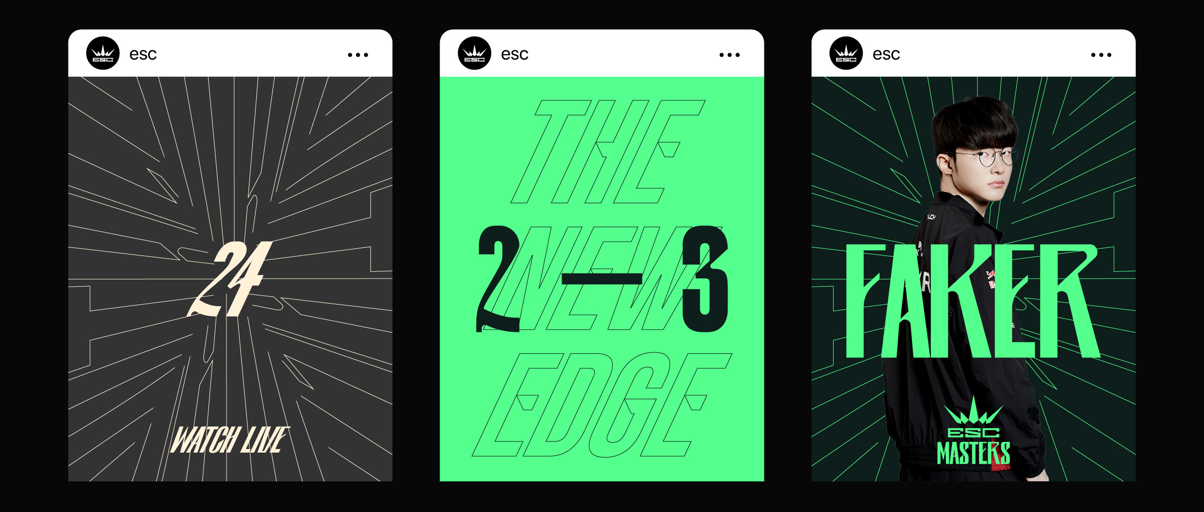
The ESC Championship branding concept is built around the idea of entry, progression, and opportunity.
Inspired by the “Esc” key, the identity symbolizes a starting point and an open gateway for players of
all levels, with a strong emphasis on the community scene. It represents an accessible competitive platform
where emerging talent can step in, compete, and develop within a structured championship environment.
Designed as a bridge between grassroots competition and elite esports, ESC creates a clear pathway for players to rise through the ranks and progress toward MASTERS, the highest level of championship play. The concept reflects growth and transition, positioning ESC as the essential stepping stone that connects community-driven competition to the professional stage.
The visual identity balances inclusivity with competitive prestige, capturing the excitement of early ambition while aligning with the established excellence of MASTERS.
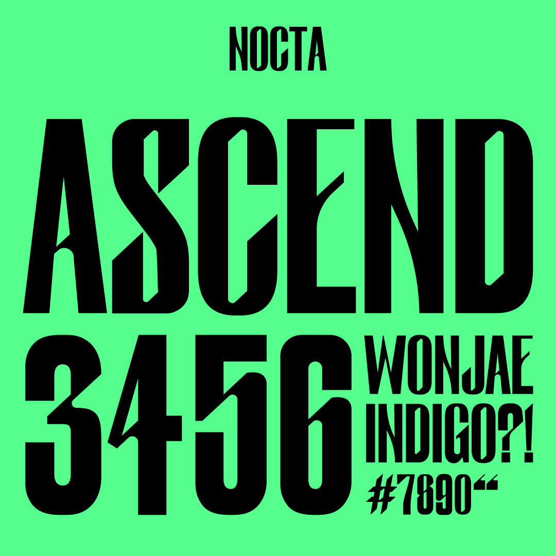

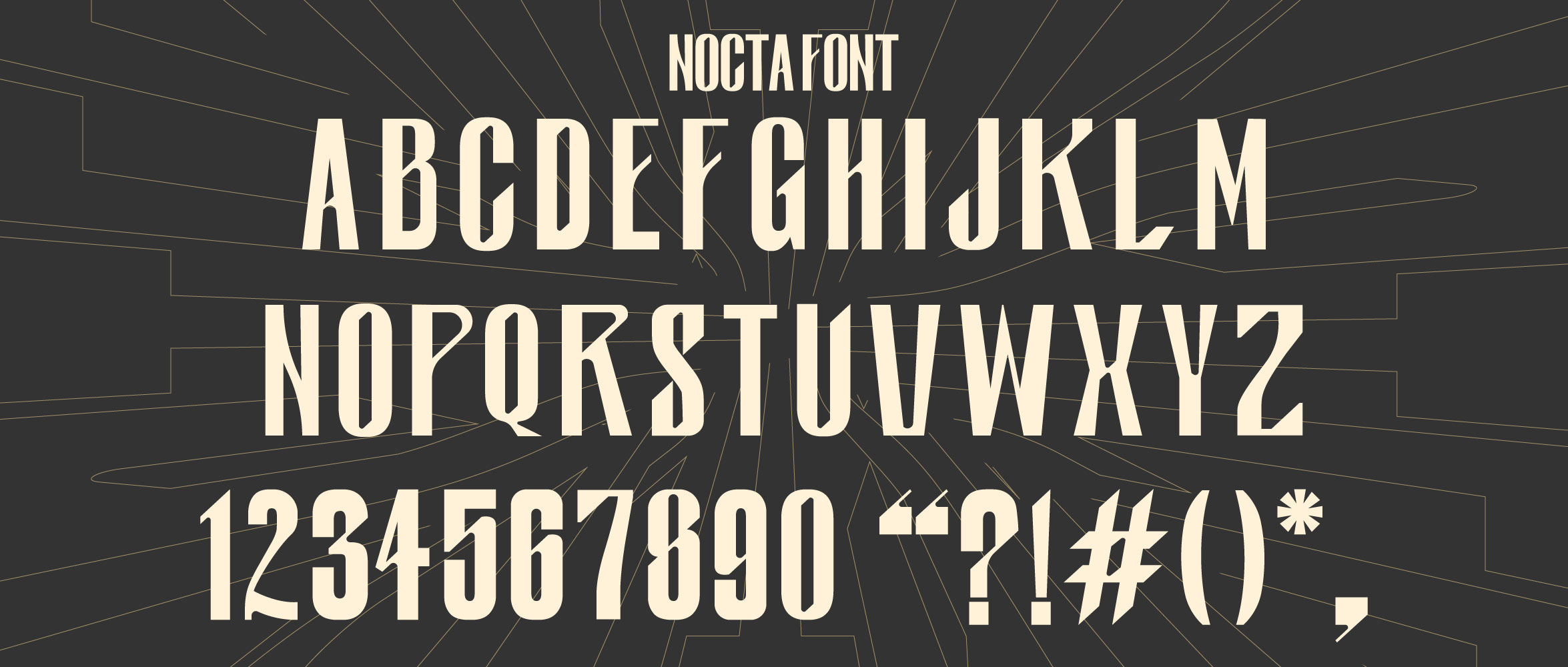

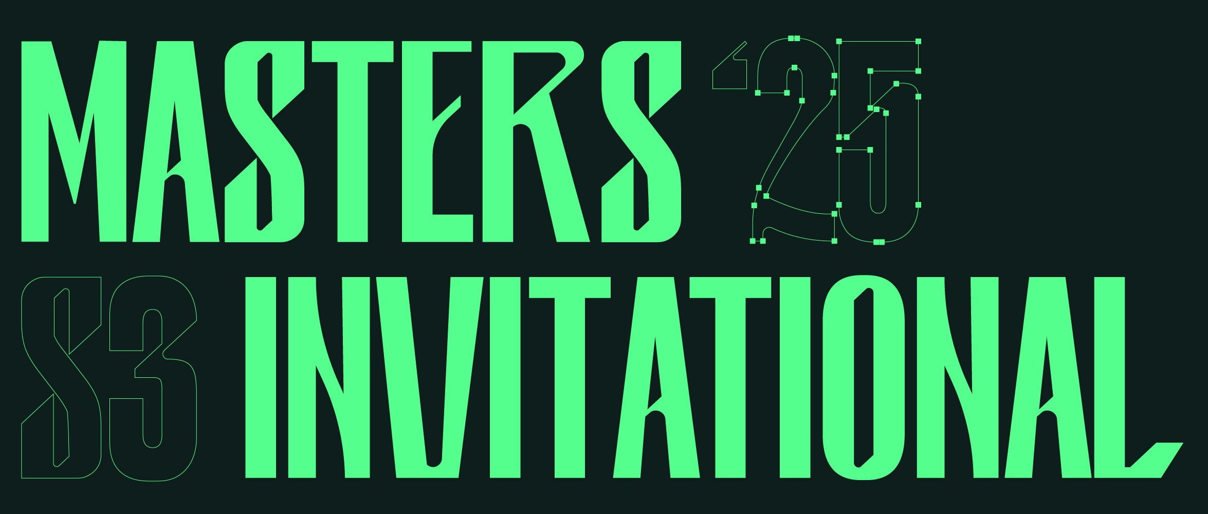
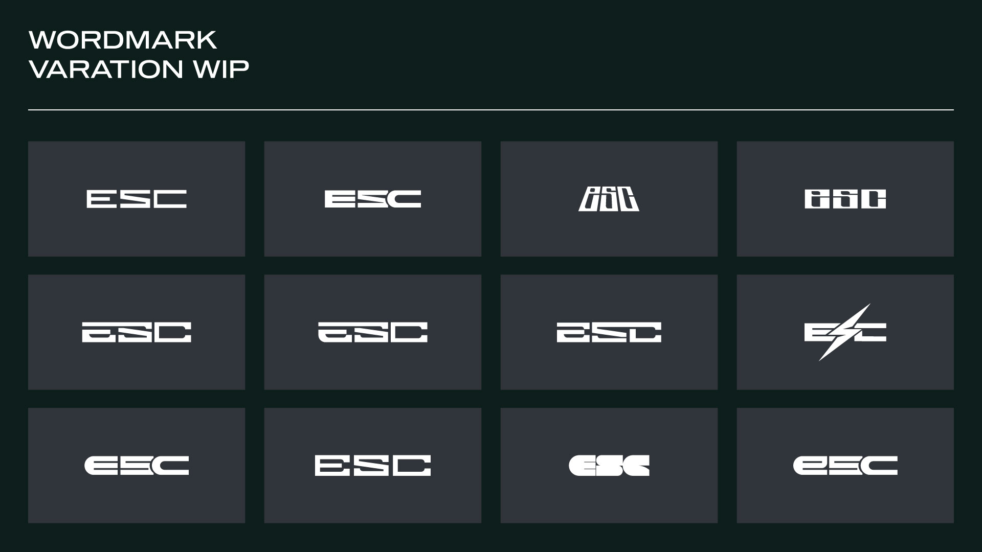
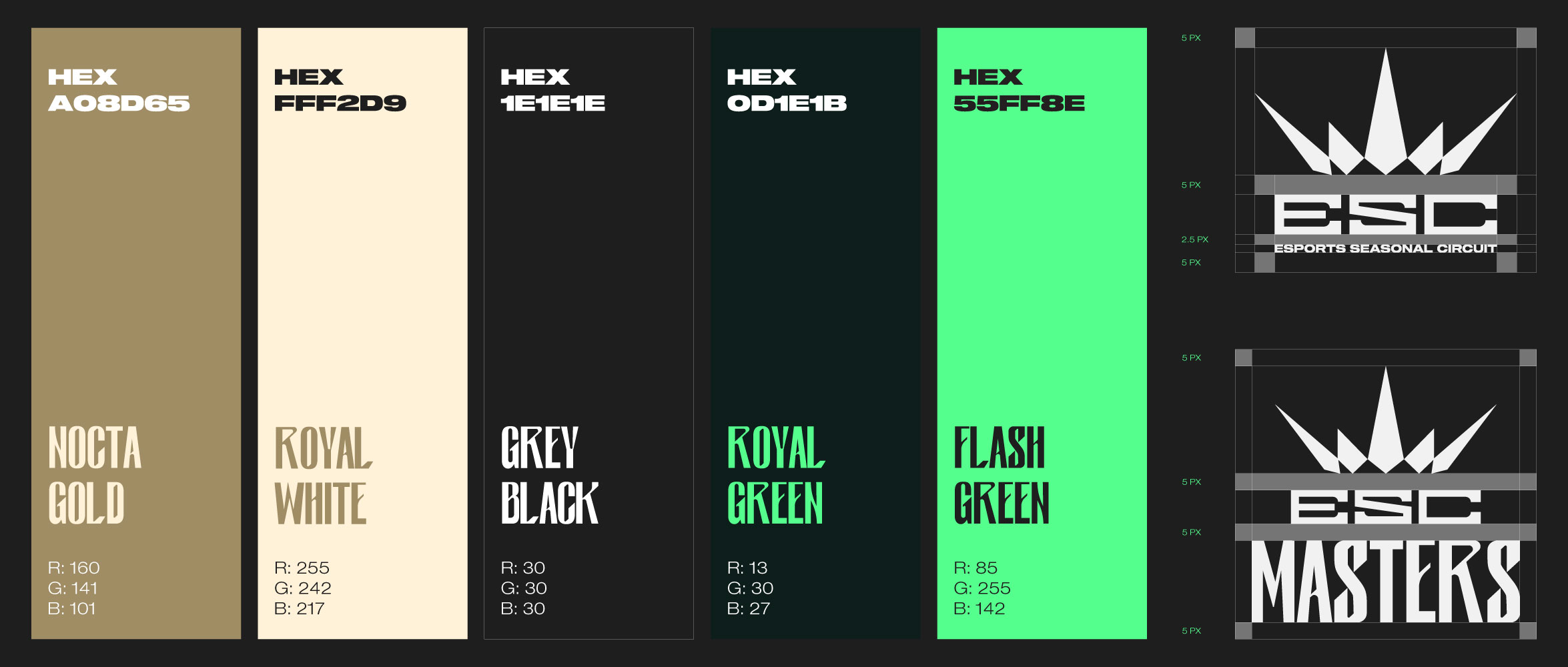
TYPOGRAPHY